Sunshine Reality Branding and Logo Design for a Gurgaon Real Estate Company
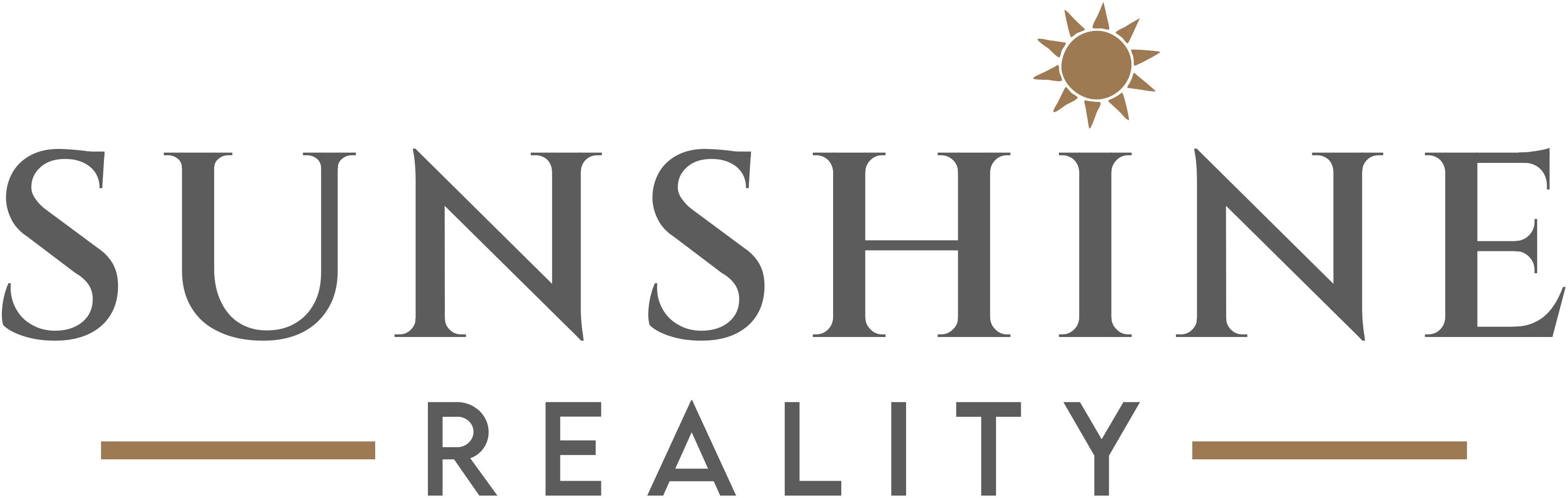
A premium serif wordmark with a small sun on the letter I, carried across every piece of business stationery.
Sunshine Reality is a real estate company based in Gurgaon. It came to Vectographics without an identity, so we built the whole brand from scratch: the logo, the colours and the business stationery.
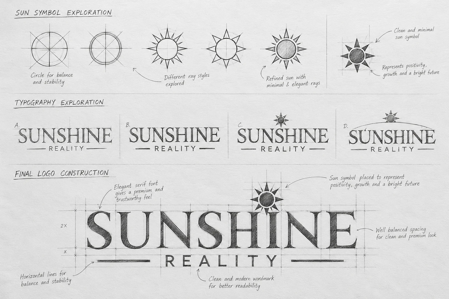
The client had one clear request: the logo had to carry a sun on the letter I. We explored the sun as a symbol, tested four typography directions and placed the final sun above the I so the name and the idea read together.
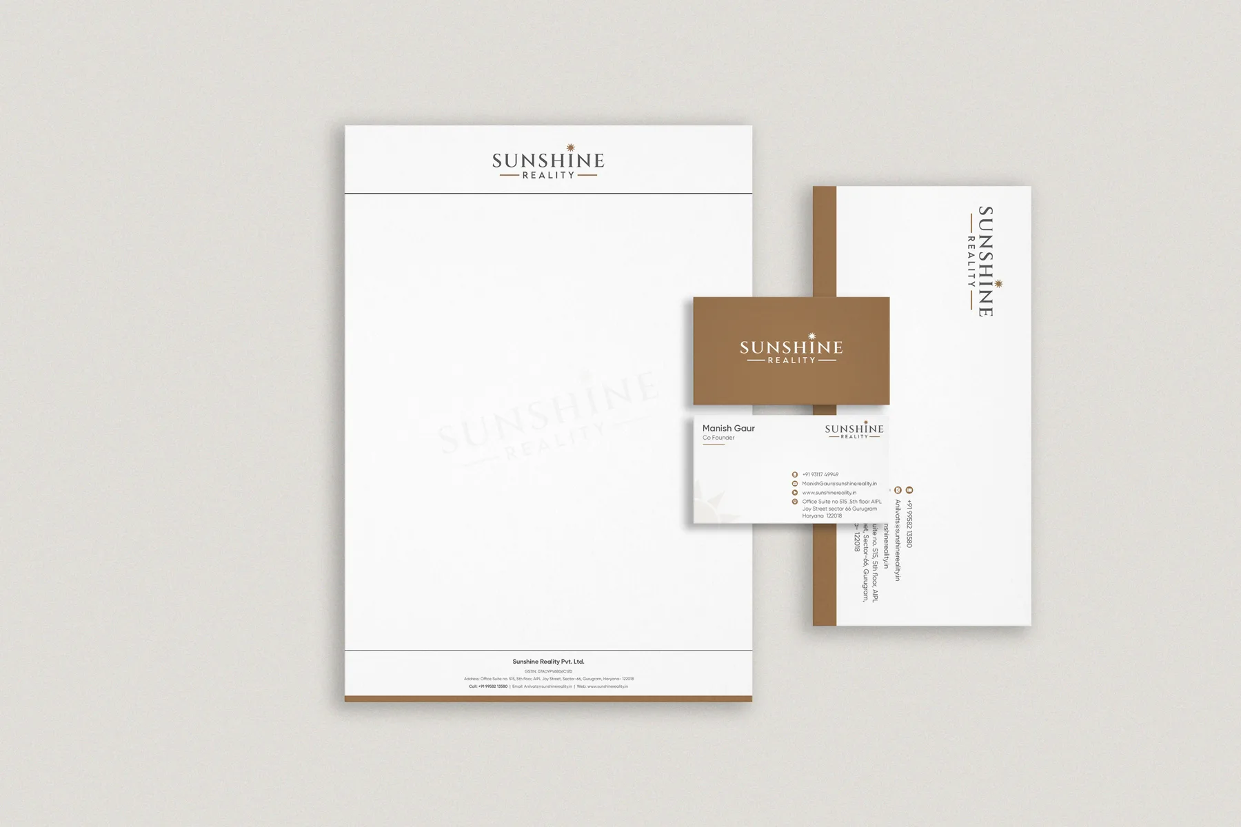
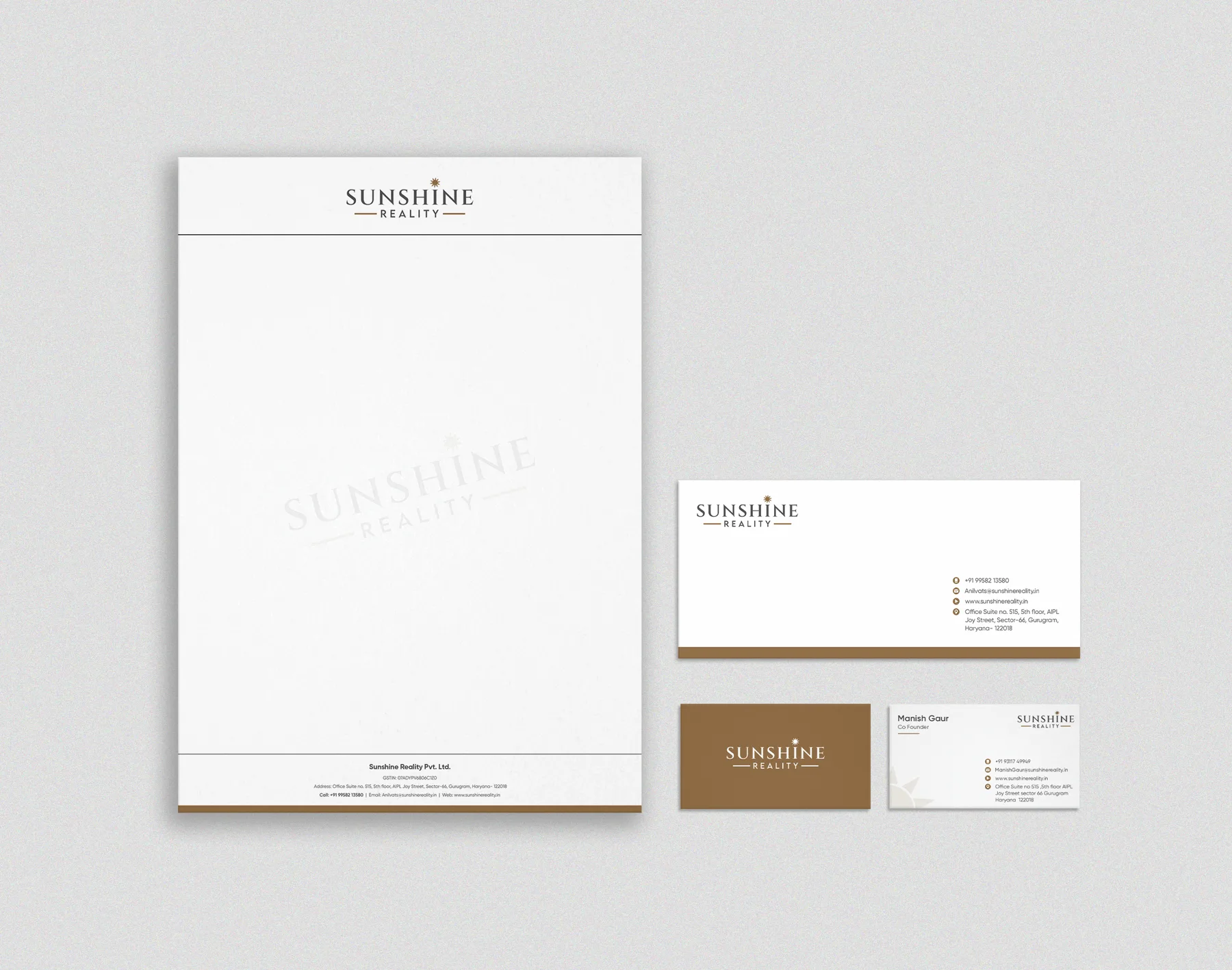
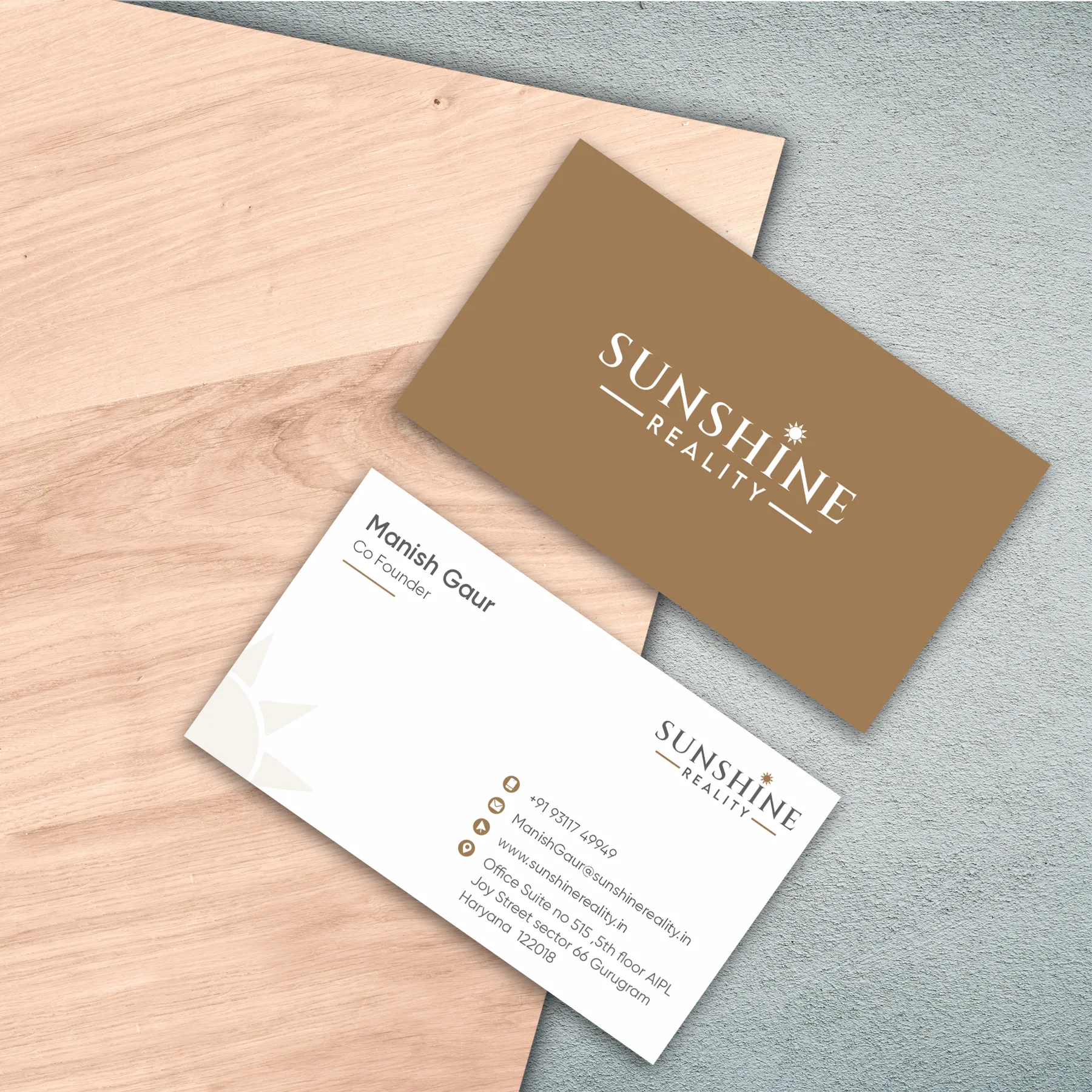
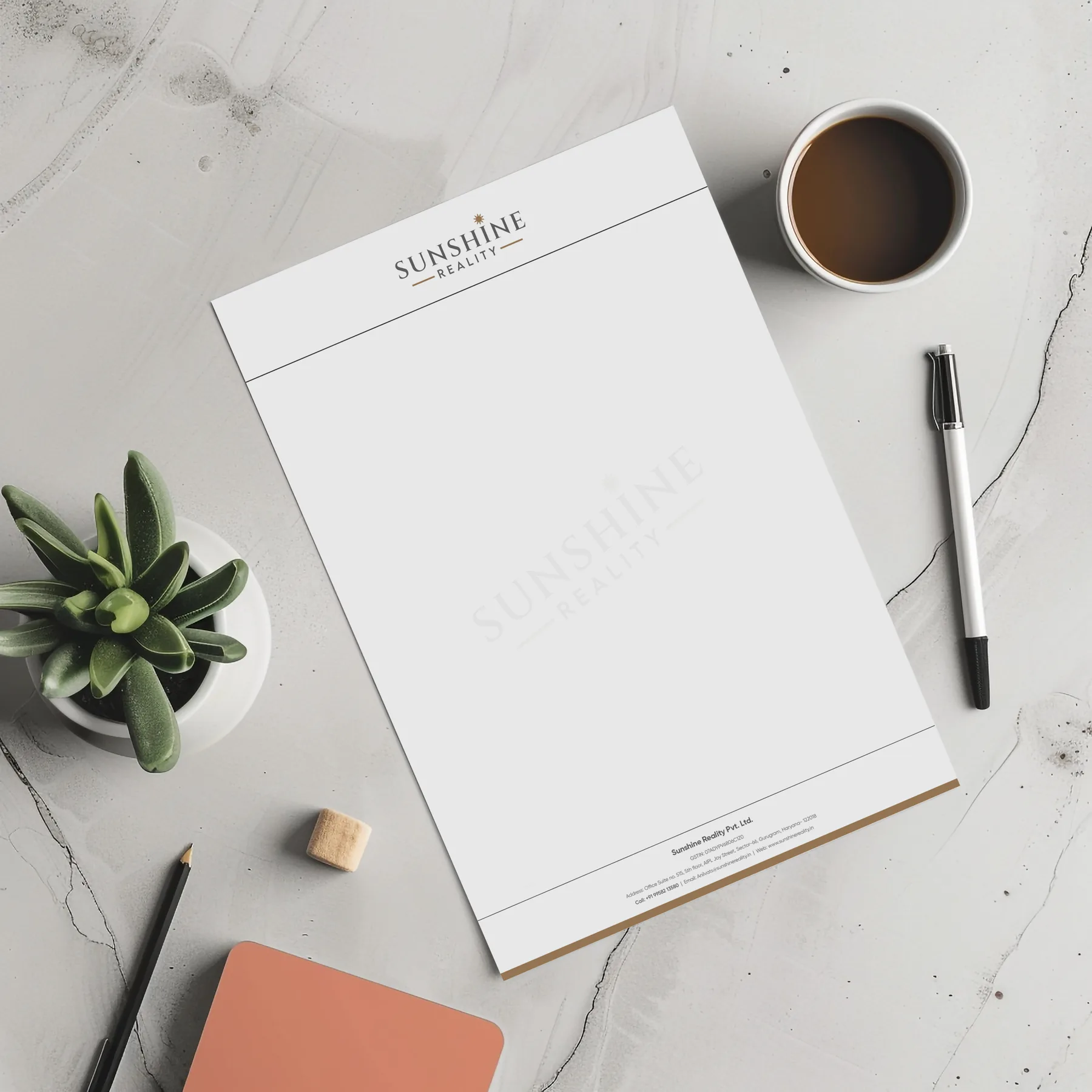
The result is a calm, trustworthy brand in warm brass and charcoal, applied to the visiting card, letterhead, envelope and employee ID card.
- Client
- Sunshine Reality
- Project
- Complete branding from scratch
- Location
- Gurgaon, Haryana
- Industry
- Real estate
- Services
- Logo design, visiting card, letterhead, envelope and ID card design
A serif wordmark with a sun rising over the letter I.
The brief asked for a sun on the letter I. We sketched the sun as a circle with rays, tested different ray styles and settled on a clean, minimal sun that stands for positivity, growth and a bright future. The wordmark is set in an elegant serif for a premium, trustworthy feel, with REALITY in a clean, modern face between two horizontal lines for balance.
We started with the sun on paper, tested four typography directions, then built the final logo on a proportion grid so the spacing stays balanced at every size.
One identity across every piece the client sends out.
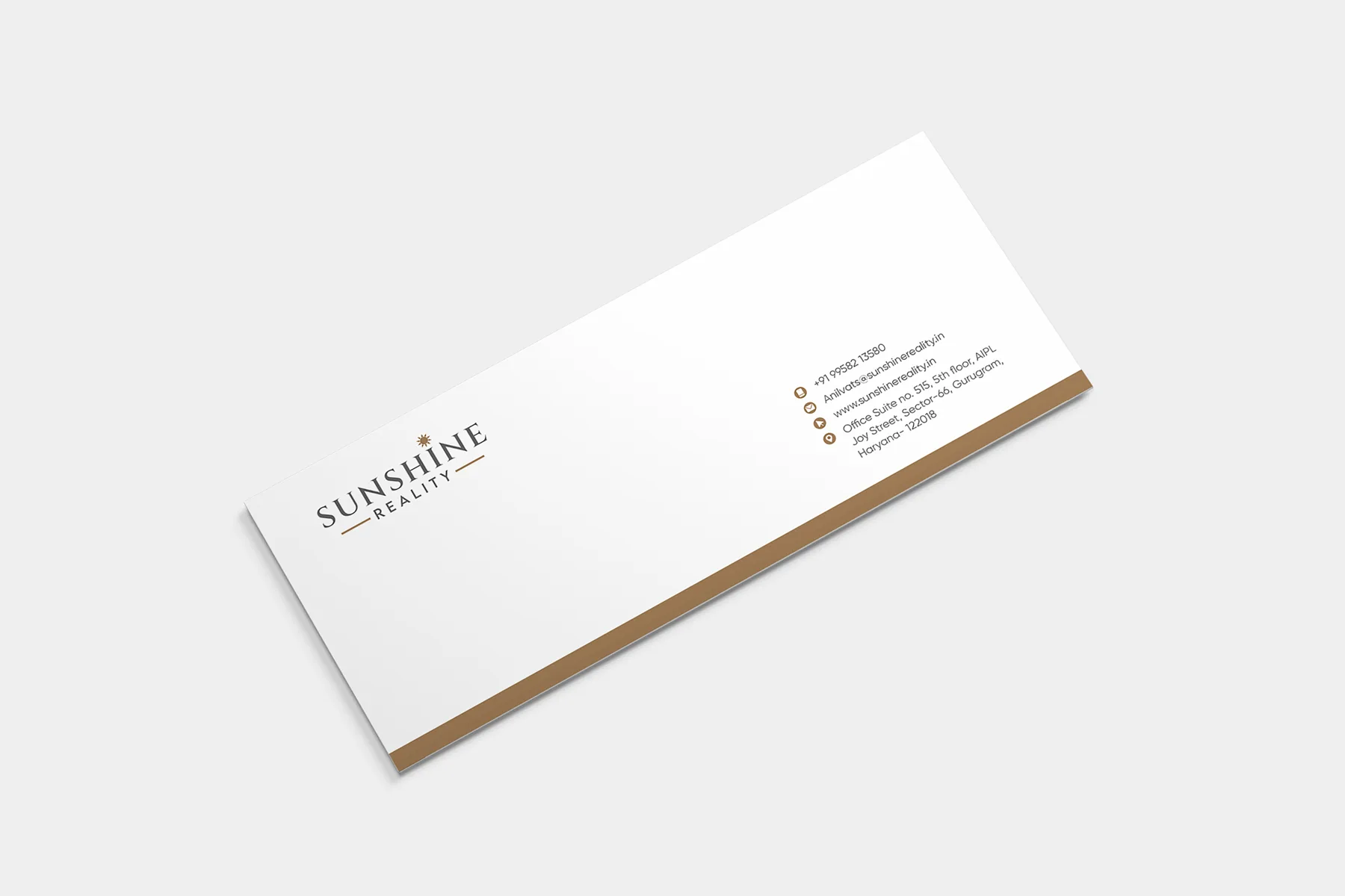
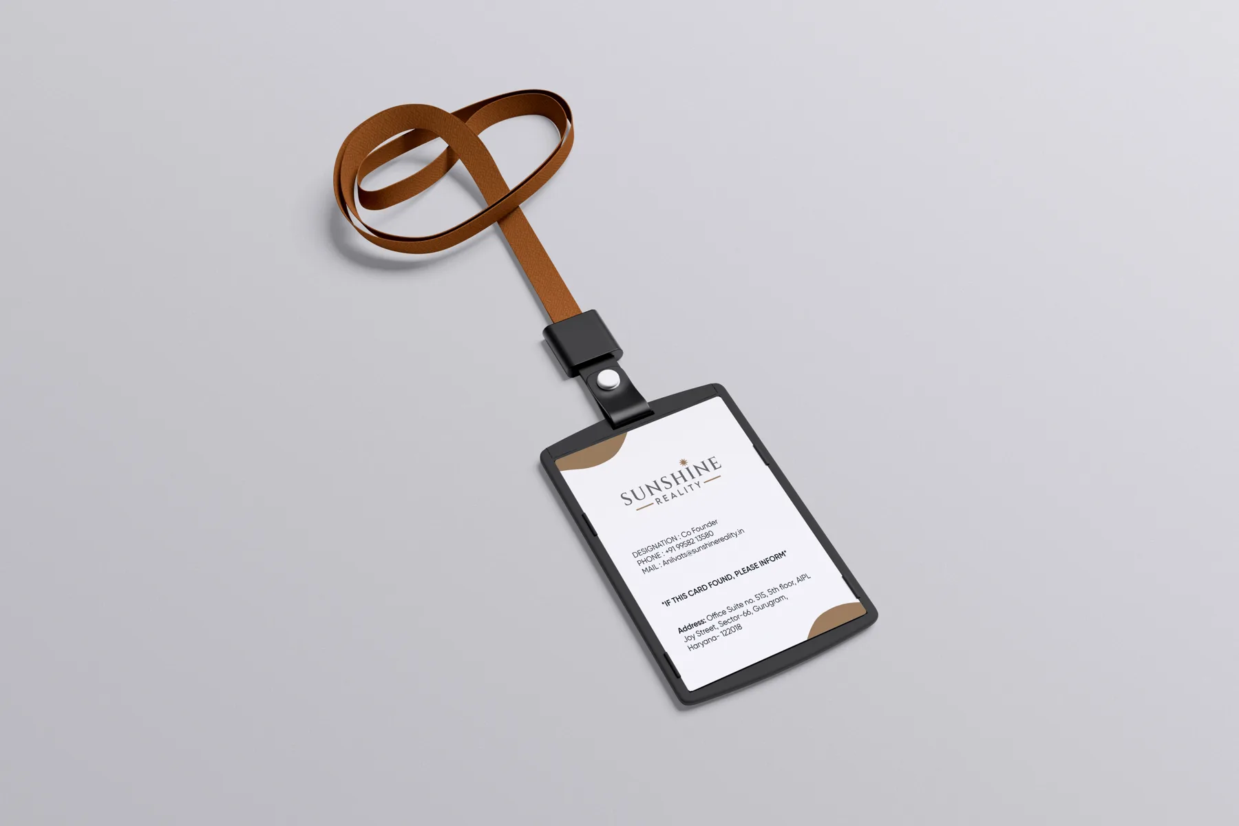
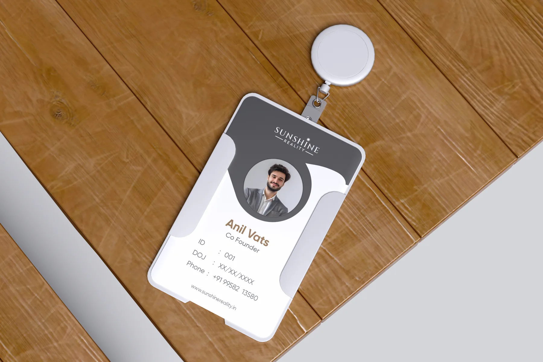
Every piece uses the same logo, the same warm brass and charcoal palette and the same layout rules, so a visiting card, a letterhead and an ID card all read as one company. Click any image to open it in full size.
- Logo with sun on the letter I
- Visiting card
- Letterhead
- Envelope
- Employee ID card
A sun with a meaning
The sun sits above the letter I as the client asked. It is small and minimal, so the name stays the hero while the symbol adds optimism and a sense of growth.
Premium and readable
A classic serif wordmark gives weight and trust, and the wide-spaced sans REALITY line keeps the second word clear at small sizes.
One system everywhere
The logo was built on a proportion grid and paired with two colours, so the same identity holds across cards, paper and ID badges.
- Logo design
- Logo process and construction grid
- Colour palette
- Visiting card
- Letterhead
- Envelope
- Employee ID card
- Print-ready files
Can you design a logo around a symbol we already have in mind?
Yes. Sunshine Reality asked for a sun on the letter I, so we explored that idea first and then refined the form and the placement until it felt balanced.
What does a real estate branding package include?
Typically the logo, a colour palette and the business stationery: visiting cards, letterhead, envelope and ID cards. We can extend it to brochures, signage and sales material.
Do you design brands for real estate companies in Gurgaon and Delhi NCR?
Yes. We are a branding studio in Gurgaon and design logos, brand identities and brochures for builders, developers and realty firms across Gurgaon, Delhi and NCR.