E-commerce Website Redesign for White Swan Appliances, a Kitchen Appliance Brand in New Delhi
From a crowded product collage to a clean, trust-led online store where shoppers find, compare and buy.


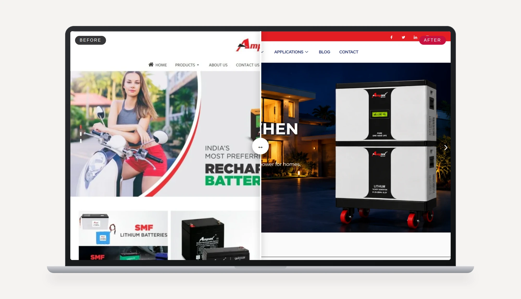
Drag the bar or use the slider. Scroll inside the screen to compare the full homepage.
White Swan Appliances makes everyday kitchen appliances: gas stoves, mixer grinders, air fryers, kettles, pressure cookers and induction cooktops. Its website had to do three jobs at once: show a wide range, build trust in a safety-critical product, and let people buy online.
The old homepage showed everything at the same weight: a photo collage, video thumbnails, a long certification paragraph and promotional posters. The new design gives each section one job, starts with the shopper's question, and shows trust signals such as ISI certification, free shipping and returns right where a buyer decides.
Use the bar above to drag between the two versions, and scroll inside the screen to compare the full homepage. The product page and cart we designed to complete the shopping journey are shown further down.
- Client
- White Swan Appliances Pvt. Ltd.
- Location
- New Delhi, India
- Service
- Website redesign and e-commerce design
- Industry
- Kitchen and home appliances
- Deliverables
- Homepage, product page, cart page, responsive layouts
A homepage where nothing stood out
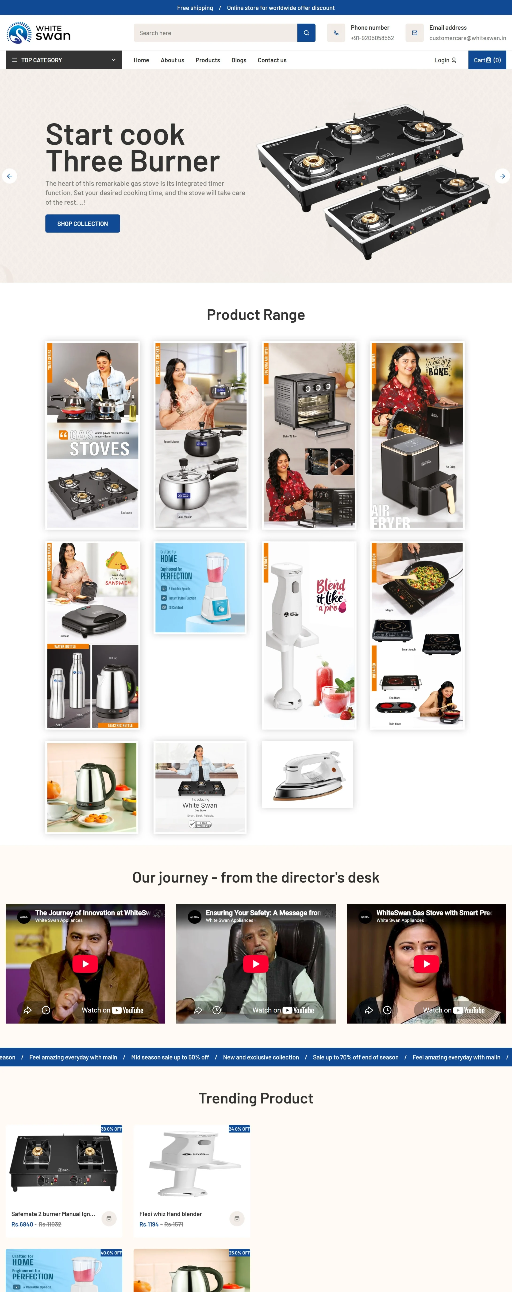
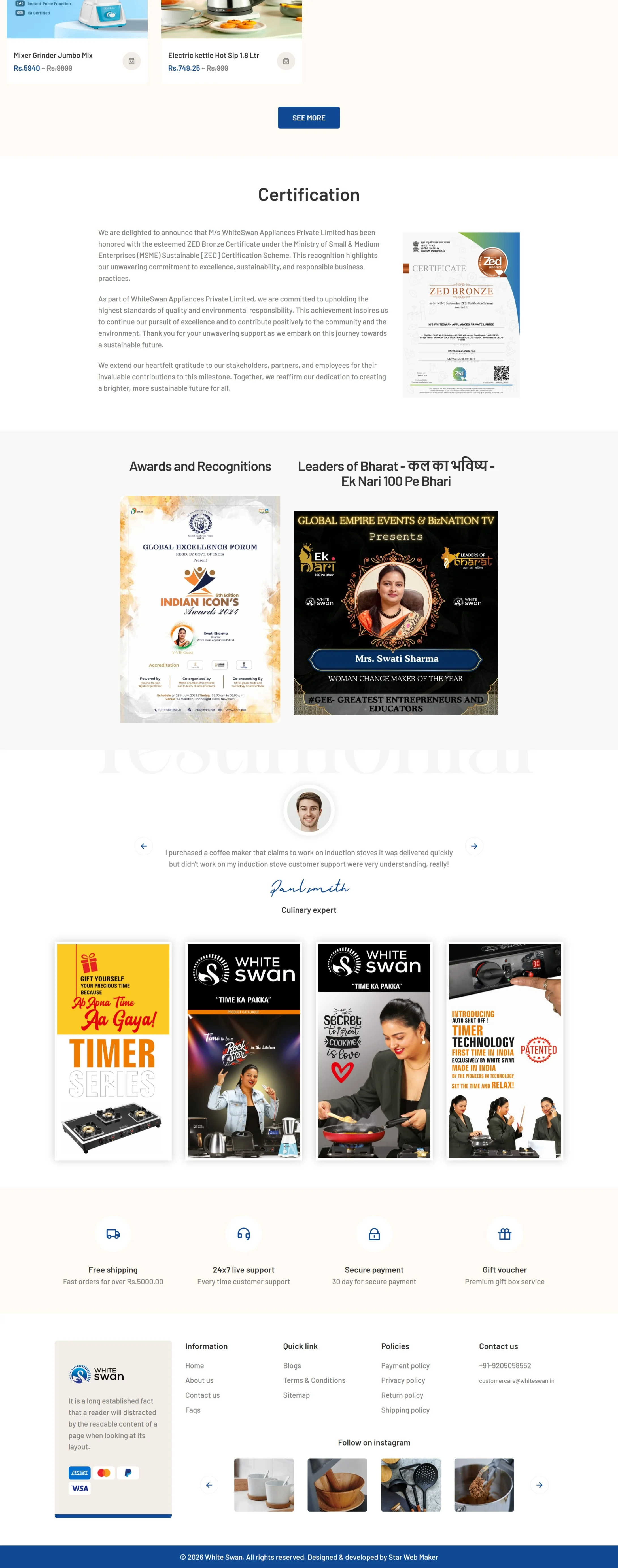
These are screenshots of the previous website, shown in two halves. Click any image to see it in full size.
A collage instead of a catalogue
The product range was a grid of photos in different sizes and styles, with no labels, so shoppers could not tell a stove from a juicer at a glance.
Too many things competing
Videos, awards, certificates, posters and product tiles all had the same visual weight, so no single message led the page.
Trust buried in text
Certification and safety, the strongest selling points for a gas stove, sat in a long paragraph far down the page.
Small, dense interface
A crowded header, small type and tight spacing made the store hard to scan, especially on a phone.
Promotions as posters
Offers were shown as flat poster images rather than as part of the shopping experience, which is slow to load and hard to act on.
No clear shopping path
There was no obvious route from browsing to a product page to the bag, so the store did less selling than it could.
Product and cart pages that finish the sale
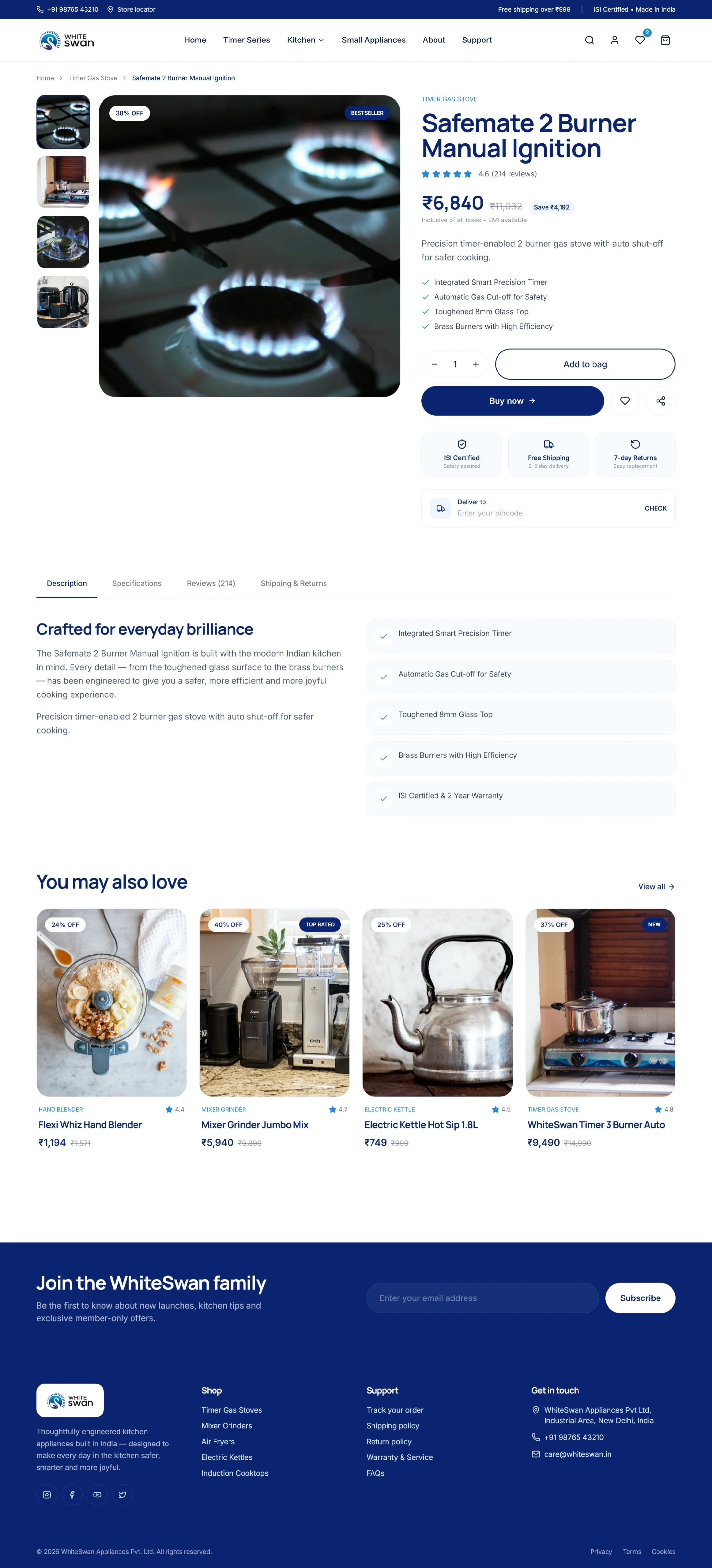
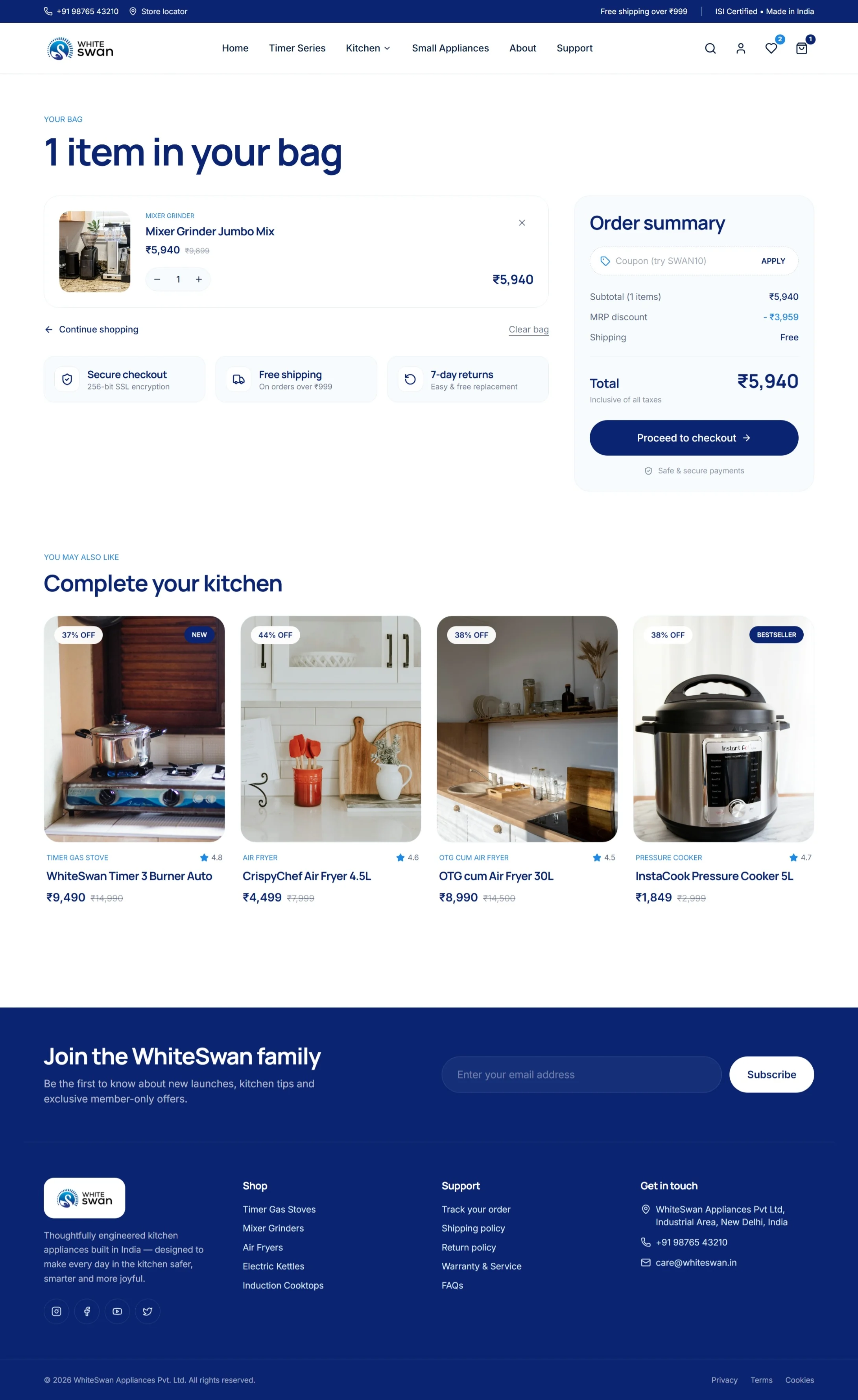
A good homepage only starts the journey. We also designed the product page and the cart in the same system, so price, savings, trust badges, delivery check and the order summary are clear at the moment someone decides to buy. Click any image to see it in full size.
How we redesign an online store, step by step
- 1
Discovery and goals
We start with the business: who buys, what they ask before they purchase, and what the store must do. For White Swan that meant building confidence in safety and quality while making the range easy to browse.
- Stakeholder interview
- Audience mapping
- Goals and KPIs
- 2
Audit of the old website
We review every section of the existing site for content, clarity, speed and search visibility, so we keep what works and fix what does not.
- Content inventory
- Usability review
- SEO and speed review
- 3
Sitemap and wireframes
We restructure navigation around how people shop: by product type, with a clear path from category to product to bag. Low-fidelity wireframes come before any visual design.
- New sitemap
- Navigation by category
- Wireframes
- 4
Visual design
We build a clean system around the brand blue: a confident hero, consistent product cards with badges and prices, generous spacing and type that reads well on a phone.
- Design direction
- Homepage, product and cart
- Mobile layouts
- 5
Content and imagery
Short headlines, category tiles and consistent photography replace the old collage, so each section explains why the product matters.
- Headlines and copy
- Image selection
- Icon set
- 6
Development and testing
The design is built as a fast, responsive store and tested across browsers and devices, with forms, links and images checked before launch.
- Responsive build
- Cross-device testing
- Form and link checks
- 7
SEO, launch and support
We add page titles, structured data and a sitemap, redirect old URLs where needed, launch, and stay on hand for fixes and updates.
- On-page SEO
- Redirects
- Launch and handover
Old store versus new store, area by area
- Homepage redesign
- Product page design
- Cart page design
- Responsive layouts
- Design system
- On-page SEO
- Old URL redirects
How long does an online store redesign take?
A store like this typically takes six to ten weeks from discovery to launch, depending on the number of pages and products, how much content is ready and how quickly feedback comes back.
Will a redesign hurt my Google rankings?
Not if it is planned. We keep strong pages and URLs, redirect anything that changes, and add proper titles and structured data so rankings are protected and can improve.
Can you design product and cart pages, not just the homepage?
Yes. We design the full shopping journey, including category, product, cart and checkout pages, in one consistent system.
Do you design e-commerce websites in Gurgaon and Delhi NCR?
Yes. Vectographics is a Gurgaon branding and web design agency working with companies across Delhi NCR and India.