Cafe Rue Spice Logo and Branding for a Cafe
Spice in every sip and bite, written as a warm handwritten script with a bold, friendly wordmark.
Cafe Rue Spice is a cafe built around spice, so its identity had to feel warm, friendly and a little bit premium. Vectographics designed the logo and the brand look from scratch.
The logo pairs an expressive handwritten Cafe with a large C, which gives it a strong and memorable shape, with a bold sans-serif wordmark, rue spice, tucked in underneath. A clean tagline, spice in every sip and bite, sits below and the registered mark closes the lockup.
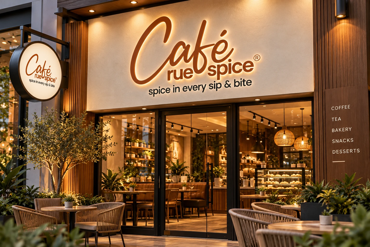
The result is a spice-brown identity that reads well on a shop facade, a hanging sign, a paper cup and a takeaway bag. The construction animation below shows how the script, wordmark, tagline and spacing were set on a grid.
- Client
- Cafe Rue Spice
- Project
- Logo and branding for a cafe
- Industry
- Cafe, food and beverage
- Services
- Logo design, tagline lockup, brand colours and brand mockups
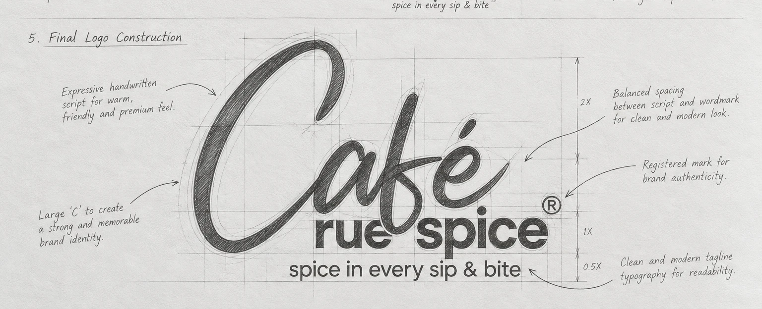
A handwritten script, balanced on a grid.
We started from a free-hand script and explored how the large C, the spacing and the wordmark could work together, then tested different alignments for readability. The final logo keeps the friendly feel of the handwriting and balances it with a modern wordmark and a simple tagline, all built on a grid so the spacing stays even at any size.
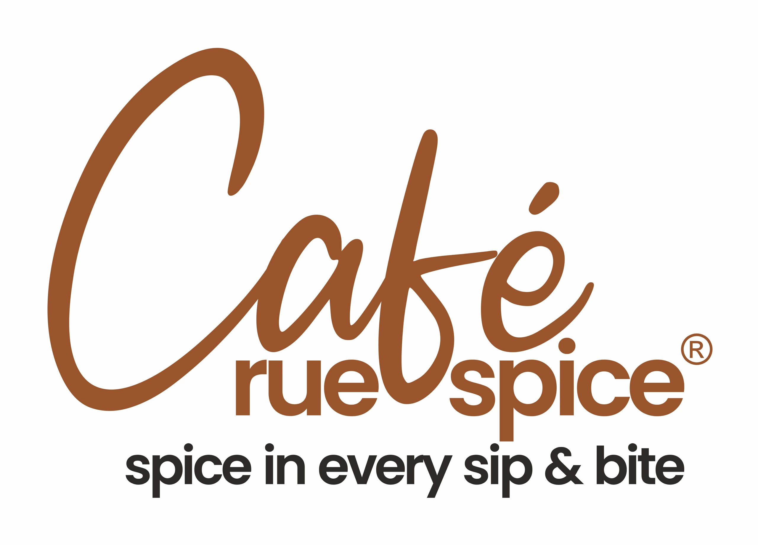
Construction grid · script, wordmark, tagline and clear space X
The final logo construction from our sketch sheet: the large C, the spacing between script and wordmark, the registered mark and the tagline.
Warm spice brown, on light and on dark.
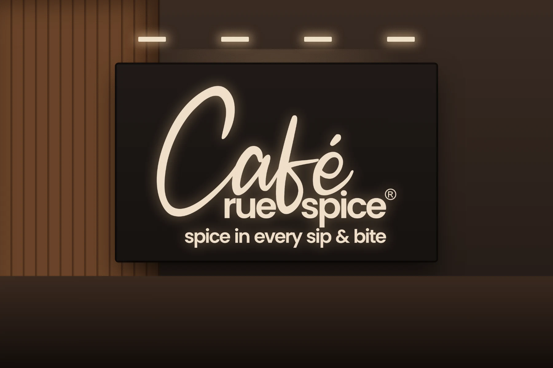
From the shop sign to the cup in your hand.
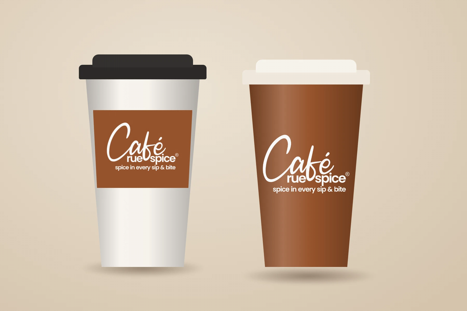
The same logo and one warm brown colour carry across the storefront, the signage, the paper cups, the visiting cards and the takeaway bag. Click any image to open it in full size.
A script with character
The large handwritten C gives the logo a shape people remember. It feels personal and warm, like a hand-written menu.
Balanced with a modern wordmark
A bold, rounded sans-serif for rue spice keeps the name clear and gives the script something solid to sit on.
One colour, many places
A single spice brown with a charcoal tagline works on light and dark backgrounds, so the brand stays recognisable on signs, cups, cards and bags.
- Logo design
- Tagline lockup
- Logo construction grid
- Primary logo on light
- Reversed logo on dark
- Brand colours
- Brand mockups
- Print-ready files
Can you design a logo and branding for a new cafe?
Yes. We design the logo, the tagline lockup, the colours and the first set of brand applications, such as signage, cups, cards and bags, so a new cafe looks consistent from day one.
Why is the logo built on a grid?
A grid keeps the spacing between the script, the wordmark and the tagline consistent, so the logo can be reproduced correctly on anything from a social icon to a shop sign.
Do you design cafe and restaurant branding in Gurgaon and Delhi NCR?
Yes. We are a branding studio in Gurgaon and design logos, menus, packaging and brand identities for cafes, restaurants and food brands across Gurgaon, Delhi and NCR.