Blumond: Dubai Real Estate Logo Design
A letter B that holds a skyline.
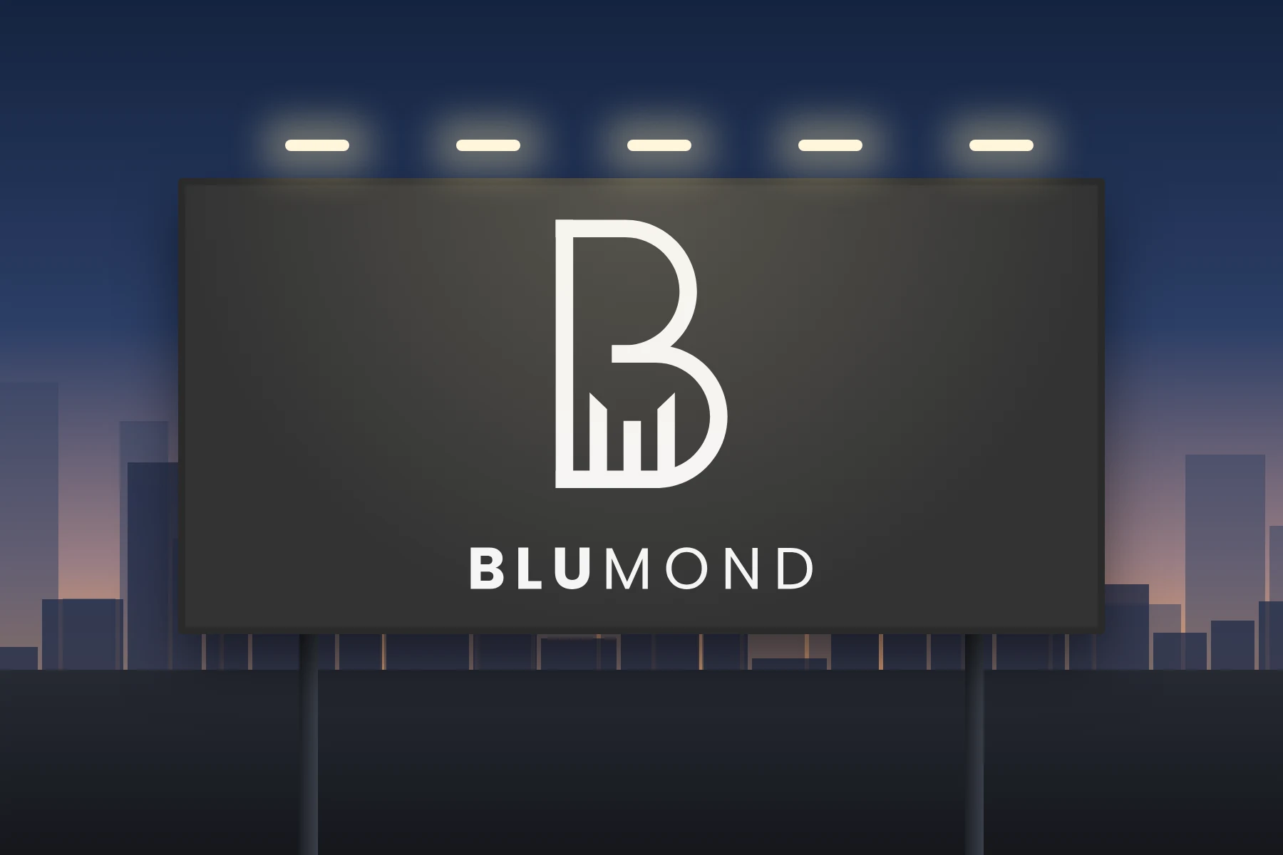
Blumond is a Dubai based real estate project. The brief was a logo that feels as confident and clean as the city it belongs to, without copying a landmark or leaning on a cliché.
We designed the logo only, and gave it everything it needs to hold up on its own: a monoline B mark, a two-weight wordmark, and a construction grid that keeps every curve and gap consistent.
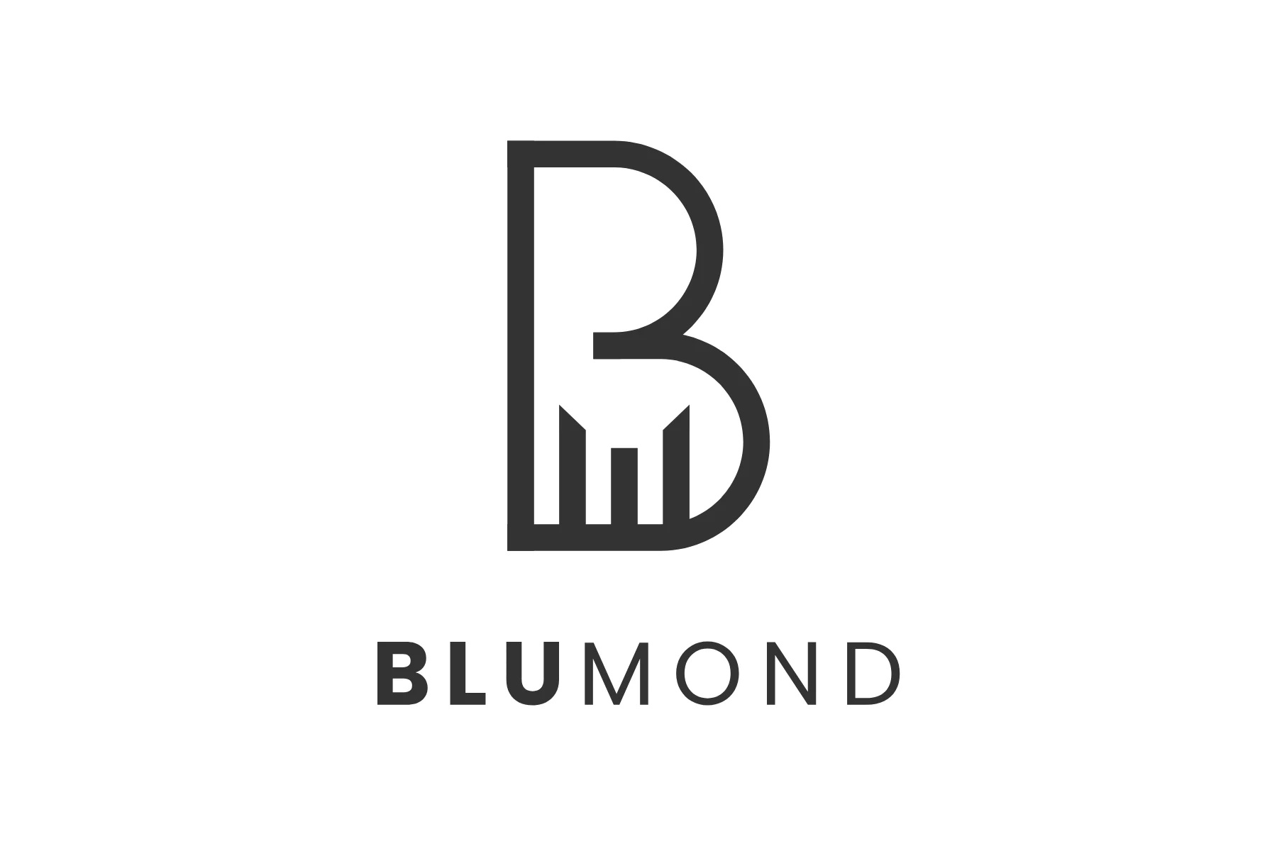
The mark is a single even line. Inside its lower bowl, three towers of different heights form a skyline that also reads as a bar chart, so the same symbol says Dubai, property and growth.
- Client
- Blumond
- Location
- Dubai, UAE
- Industry
- Real estate
- Scope
- Logo design only
- Studio
- Vectographics, Gurgaon
A letter B that holds a skyline.
The Blumond logo starts with the letter B drawn as one monoline stroke on a grid where one unit equals the line weight. Two equal circles make the bowls, a straight spine holds them, and three towers rise inside the lower bowl. The wordmark sets BLU in bold and MOND in a light weight on a single cap height. Step through the build below, or open it full screen.
The grid
Everything starts on a grid built from the stroke weight of the letter. One unit is the line thickness, so every curve, gap and tower is a whole multiple of it.
Three ideas, one clean line.
A skyline, not a landmark
Dubai is known for its towers, so the city sits inside the letter itself as three towers of different heights. It is recognisably a skyline without borrowing any real building.
Growth built in
The same three towers read as an ascending bar chart. For a real estate brand that is the right second meaning: value, investment and momentum, in a shape small enough for an app icon.
One weight, two weights
The mark is monoline for a precise, architectural feel. The wordmark then contrasts bold BLU against light MOND, with wide tracking that feels spacious and premium.
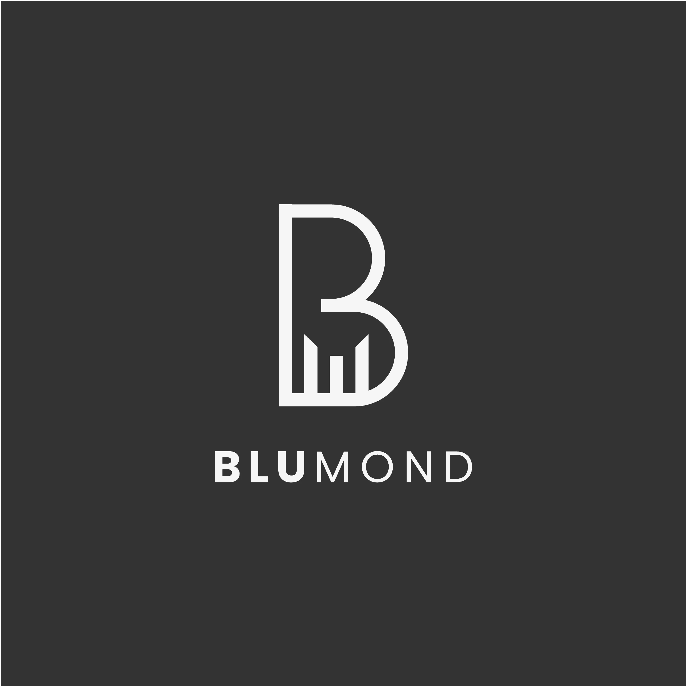
The final Blumond logo, master artwork
Made to work on a tower, a sign and a phone screen.
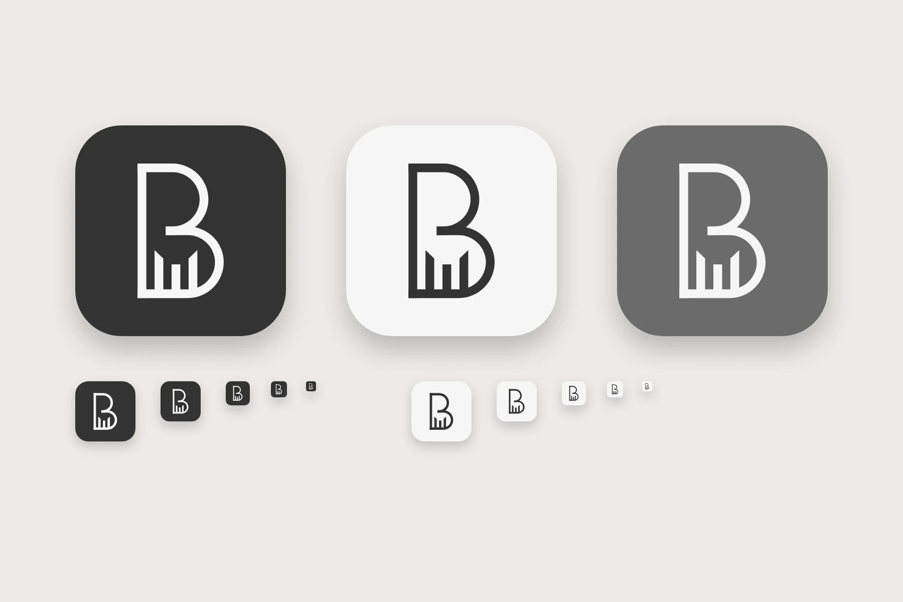
We delivered the logo only. These presentation mockups show how the artwork behaves on a plaque, in light and dark, and shrunk down to an app icon.
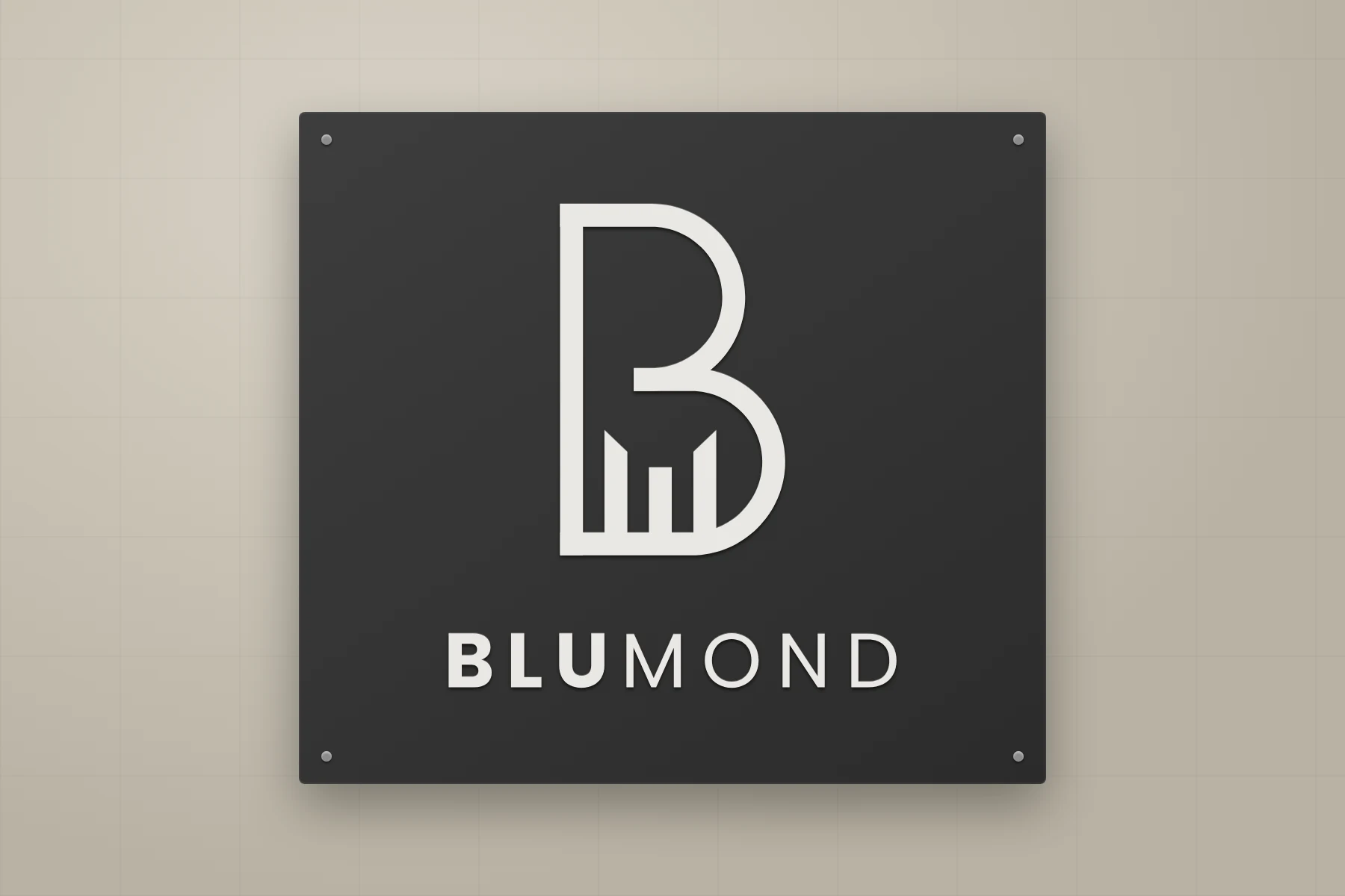
- Logo mark (monoline B and skyline)
- Wordmark BLUMOND
- Primary logo lockup
- Reversed logo on dark
- Construction grid
- Icon and favicon versions
Is Blumond a Dubai project?
Yes. Blumond is a Dubai based real estate project. Vectographics designed its logo from our studio in Gurgaon, working with the client remotely.
Did Vectographics design more than the logo for Blumond?
No. For Blumond we did the logo design only. The mockups on this page are presentation visuals made to show how the logo behaves on a sign, a plaque and an app icon.
Do you design logos for real estate brands outside India?
Yes. We design logos for property developers, agents and real estate brands in India and the Gulf, and deliver the full vector files, the construction grid and light and dark versions.
What does a real estate logo from Vectographics include?
A logo concept built on a construction grid, the final vector artwork, a reversed version for dark backgrounds, and icon versions tested down to favicon size.