An identity for safety footwear, built from zero
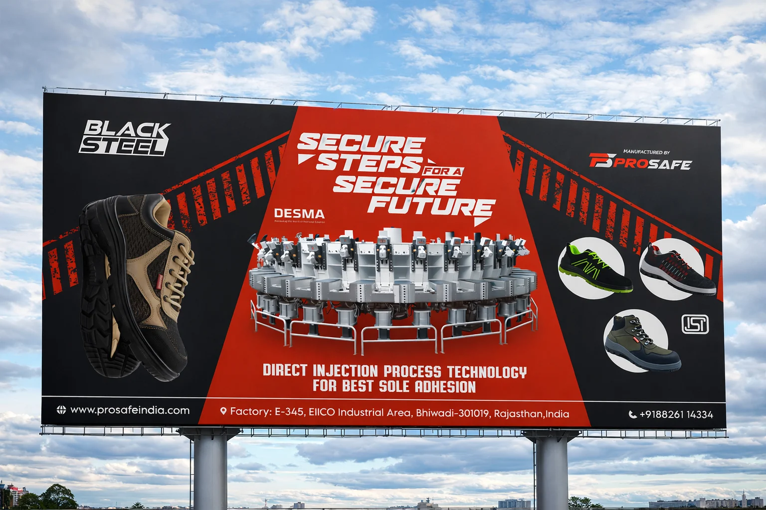
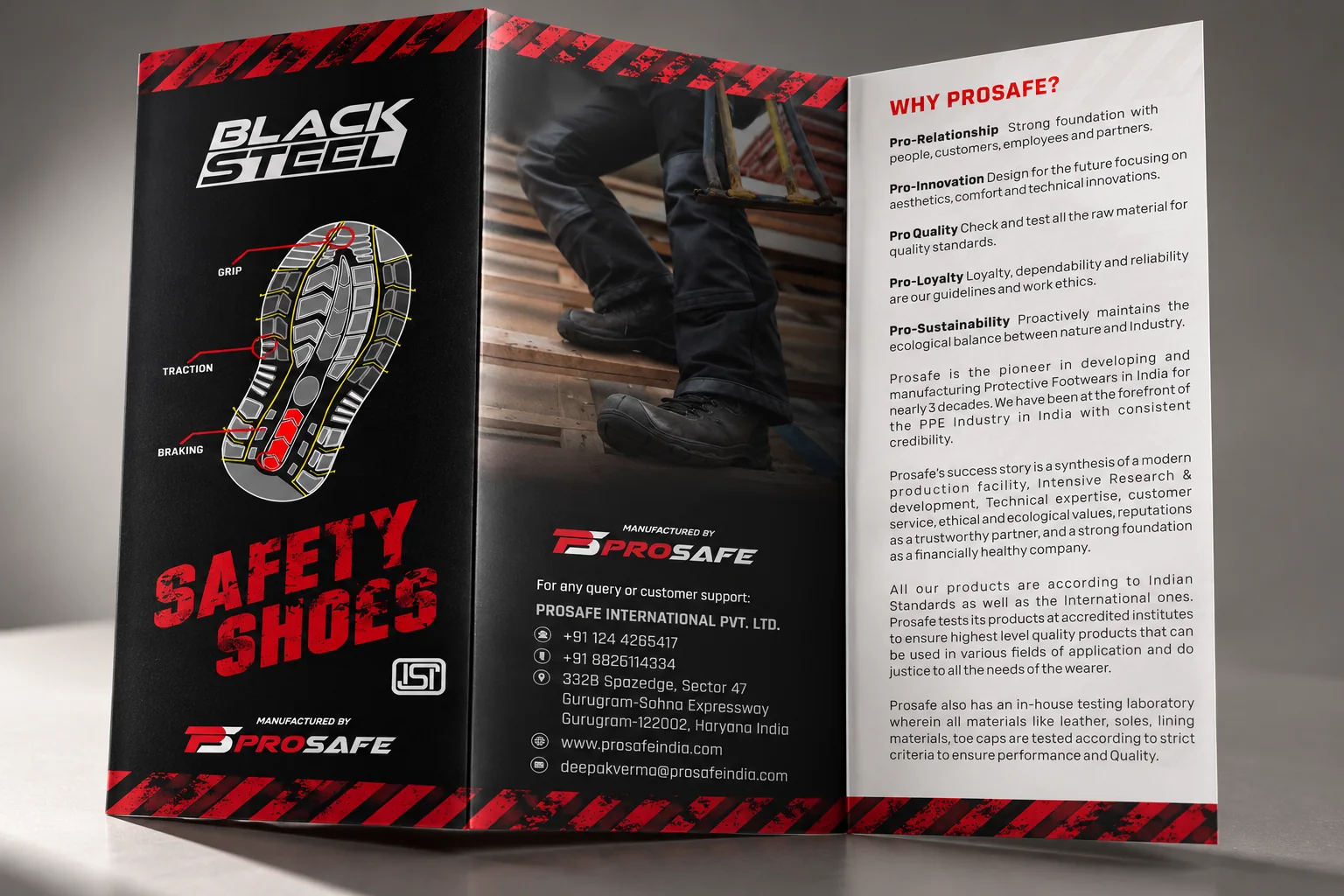
Black Steel is a range of industrial safety shoes. We drew the logo from scratch, then carried one red-and-black system through a 16-panel fold-out brochure, a shoe box and an outdoor hoarding.
We drew the logo from scratch
Measured on the final vector artwork.
Every letter is custom. Nothing is set in an existing font, so the shapes can be tuned to fit the plate.
The letters, the stem of the B and both ends of the plate all lean at the same 15°. That shared angle gives the mark its speed.
BLACK sits above. STEEL is reversed out of a solid plate that is about 15% taller, so the second word carries the weight.
The plate steps up beside the K, which ties the two lines together into a single block that is hard to separate.
Warning-sign red on steel black
Colours sampled from the finished artwork.
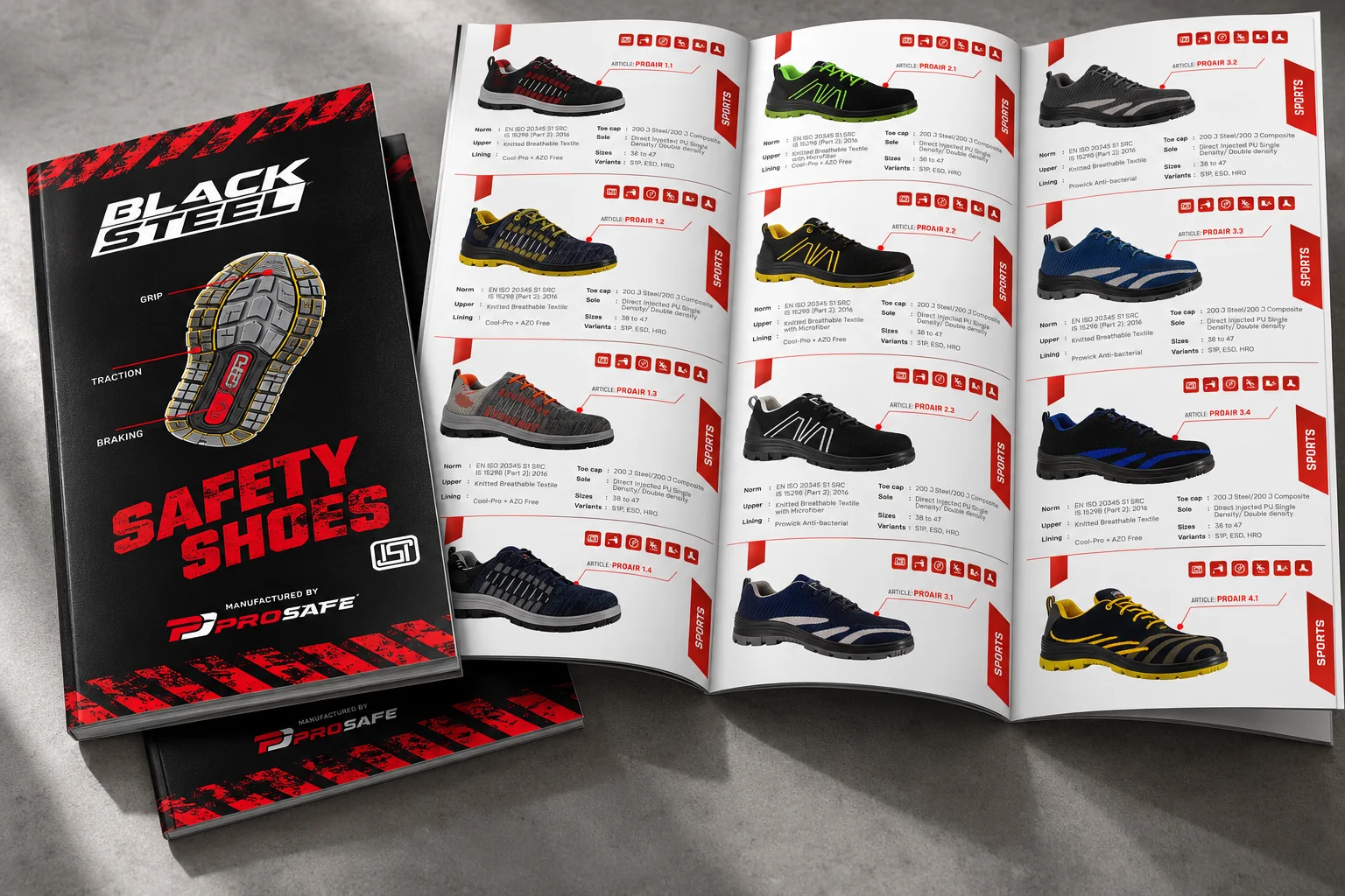
A 16-panel fold-out catalogue
The brochure unfolds as sixteen panels, one per product series, each with the same layout so buyers can compare soles, toe caps and specifications at a glance. Tap any panel to read it in full.
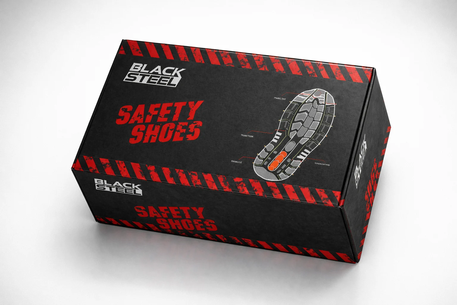
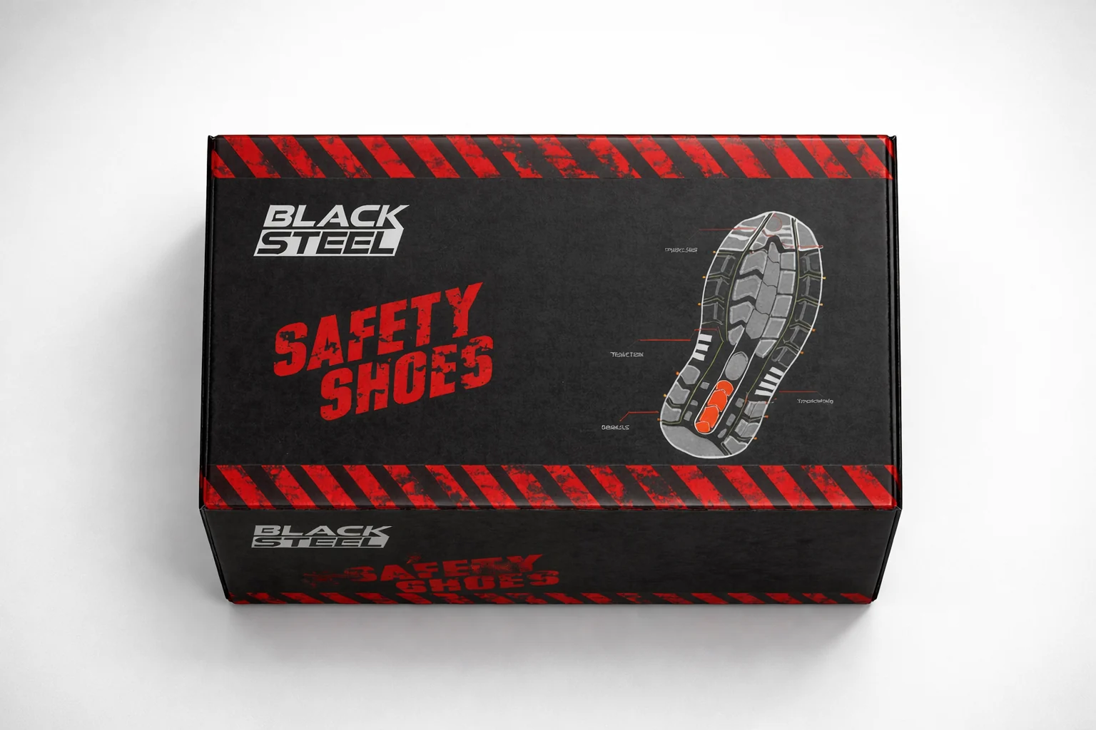
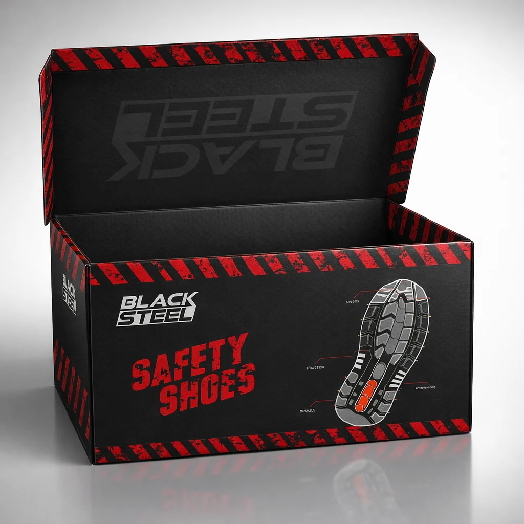
A shoe box that looks like a warning sign
The shoe box carries the logo and a sole diagram on a black lid, edged with red hazard stripes. Open it and the logo is printed again inside the lid.
Secure steps for a secure future
For the outdoor site we cut a red wedge across a black board, put the hero shoe on the left and the full range on the right, and gave the headline room to be read from the road.